

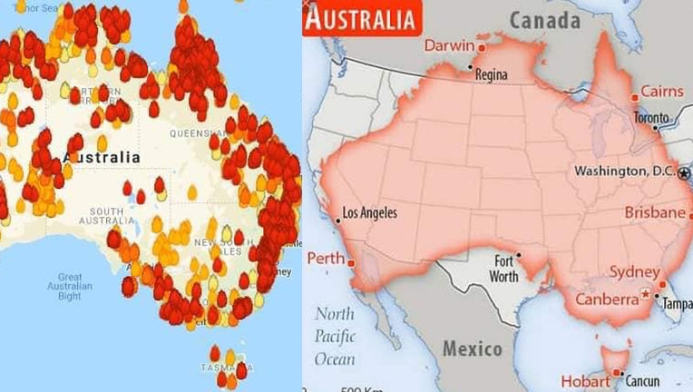
Maps show Australia's massive wildfires compared to size of United States
(Courtesy: Sonoma County Fire Department)
Two maps showing Australia's deadly wildfires demonstrate just how widespread the inferno is compared to the size of the United States.
The Sonoma County Fire District posted the images on Facebook, showing the number of fires in the country along with a map that superimposes Australia on top of the United States.
The juxtaposition shows that, if the same fires happened in the U.S., most of the states would be burning.
Related: Bindi Irwin and family have treated more than 90,000 animals hurt in Australia wildfires
Nationwide, at least 25 people have been killed and 2,000 homes destroyed by the blazes, and ecologists estimate nearly half a billion animals have died.
Australia's government said Monday it was willing to pay “whatever it takes” to help communities recover from deadly wildfires that have ravaged the country.
Prime Minister Scott Morrison said the government was committing an extra 2 billion Australian dollars ($1.4 billion) toward the recovery effort in addition to the tens of millions of dollars that have already been promised.
“The fires are still burning. And they’ll be burning for months to come,” Morrison said. "And so that’s why I outlined today that this is an initial, an additional, investment of $2 billion. If more is needed and the cost is higher, then more will be provided.”
The Associated Press contributed to this report.